- By Lee Roden
There’s now a greater need than ever to communicate complicated, abstract data in an effective way...


There’s now a greater need than ever to communicate complicated, abstract data in an effective way...
Whether you’re building a Go-to-market strategy packed with vital data points, attempting to increase understanding around your sustainability and development work, or trying to roll-out vaccines that will be key to ending a global pandemic, all organisations must at some point successfully convey results in the form of data.
When done poorly however, the interest of the target audience will quickly be lost, be they stakeholders, consumers or any other parties you are tasked with reaching. And though data is more prevalent than ever, it remains difficult to make easily comprehensible.
 The good news is that human beings have been telling complicated stories for thousands of years. By tapping into tried and tested traditional storytelling methods designed to make an emotional connection with an audience, and adapting them to include data, it is possible to get those difficult points across while maintaining the attention and understanding of the groups we are attempting to speak to.
In this blog post, Whispr Group outlines some essential cornerstones of effective data-driven storytelling, and how data insights go hand in hand with successfully deploying them. We’ll also flag up some common pitfalls in the area to avoid, as well as highlight some best practice examples to follow ahead of our more detailed white paper on mastering data-driven storytelling to come in the near future.
It is easy to fall into the trap of believing that a noteworthy data point is inherently interesting and will do its own legwork when it comes to communicating it. But just because the person or organisation attempting to communicate understands the importance of a key piece of data, does not mean the target for that communication will also automatically do so.
An old mantra from the world of journalism can be applied here: never make assumptions about your audience’s knowledge. The overarching goal is to avoid confirmation bias, and ensure that data is comfortably and properly grasped by providing the right kind of context, conveyed through an emotionally engaging narrative.
Sustainability communication in particular has struggled to connect audiences with its most important data points in a meaningful way, often leading to a misunderstanding of key issues. Of which a pertinent example reared its head in 2020.
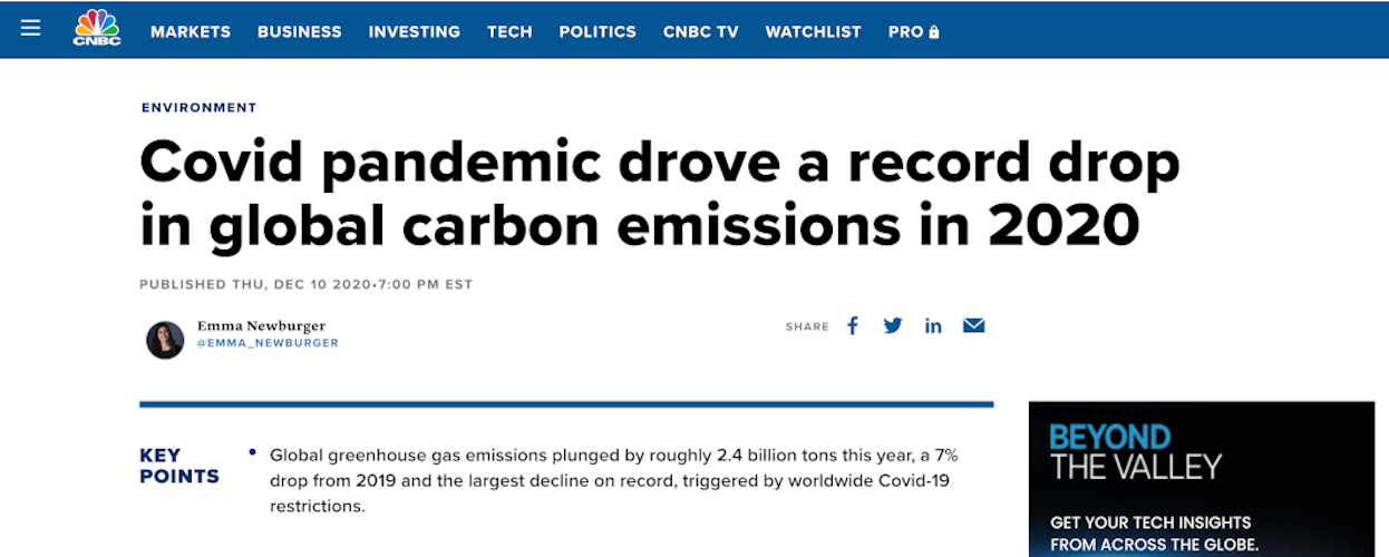
Remember when air traffic all but ground to a halt as the covid-19 pandemic picked up pace last April? Jubilation soon followed about the dramatic drop in CO2 emissions that occurred, and headlines in major international media outlets ensured data demonstrating that drop achieved widespread reach.

But the impact of lockdowns on emissions was overplayed, and the data lacked vital context: just a month later, the concentration of CO2 in the atmosphere was up to 418 parts per million. That’s the highest ever recorded, so should we really have been celebrating?
In reality, had lockdowns not happened and emissions continued as normal, the CO2 concentration in the atmosphere would only be 0.4 parts per million higher – halting air travel was but a drop in an ocean-sized issue. That’s a hugely important fact that scientists are well aware of, but has not been effectively communicated.
{{cta(‘f719990c-8330-4c39-be4c-a5808771c713’)}}
“Climate change is a cumulative problem,” as Glen Peters, climate scientist at Norway’s Center for International Climate Research explained to National Geographic. “It’s not like other pollution where someone puts something in a river, then stops putting it in and the problem is solved. It’s all our emissions in the past that matter”.
 One other example of inadequate data-driven storytelling could prove particularly perilous in 2021: failings in vaccine fact communication and the growing anti-vaxxer narrative.
At the same time as the approval of several effective covid-19 vaccines provides hope for the return to normality and turning the tide of the pandemic, the rise of the anti-vaxxer movement as well as the growth of less hardened but still skeptical “vaccine hesitant” groups puts the effectiveness of immunisation at serious risk. Vaccines only work to their maximum potential if a large proportion of the target population takes them – so even a small number of unvaccinated people can massively facilitate a disease in spreading and surviving.
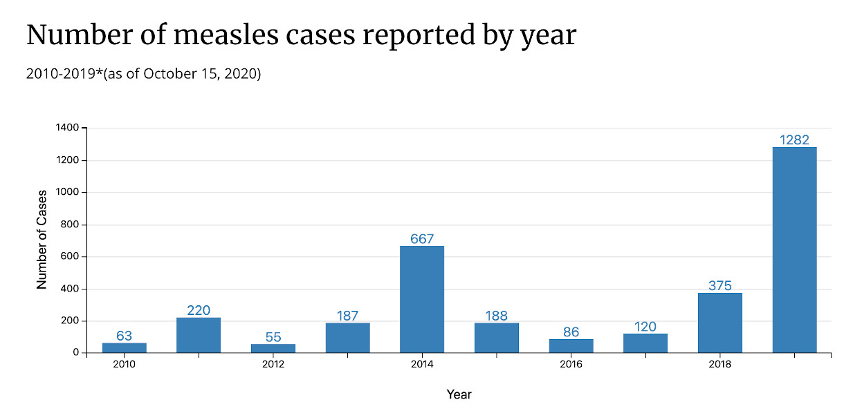
So it has proven with one disease previously eliminated in countries like the US but now back: the measles. Its return shows that the fact-based vaccine discussion is no longer succeeding to the extent it needs to, a core problem being the misconception that vaccines are about the individual’s preference, rather than a dutiful contribution to the collective good.
In the 20th century, efforts to communicate the collective need to take a measles vaccine in order to achieve the realistic possibility of eradicating the disease were so successful that by the mid 2000s it was indeed considered eliminated in the US. But the fact-based discussion didn’t keep up with a changing landscape, in particular the rise of the internet as a source of both information and misinformation. And so, there are now pockets of the measles in the US once again.

(Data for the US. Source: CDC)
The measles example could be worryingly relevant this year, as recent surveys show almost a third of Americans are hesitant to take a covid-19 vaccine, and similarly large percentages of vaccine skepticism have been registered in surveys in other comparable countries. Improved communication about the facts regarding covid-19 and immunisation against it will be decisive to the success or failure of reaching hesitant or resistant groups.
We’ll have a more detailed analysis of the pitfalls to avoid in data-driven communication in our in-depth guide, but for now, let’s look at the opposite side of the coin: the best-practice examples.
There’s another case of data-driven storytelling that caught attention in 2020 for the right reasons. A 2015 clip of Bill Gates speaking with data-focused media outlet Vox went viral in the spring because the Microsoft co-founder and philanthropist predicted the coming of a global pandemic in eerily specific terms, five years before one happened. It now has over 11 million views on Youtube alone.
The video’s big achievement is that it communicates a complicated concept (how a disease could spread from one country to the entire globe in a matter of days) founded in challenging data (the variables disease modelling programs use to predict potential epidemics) via an effective and engaging format (a single interview video, with occasional animations, that’s only four minutes long and hinges on the easily relatable example of the Spanish flu).
Gates surely learned a thing or two from his friend, the late Dr Hans Rosling, whose “magic washing machine” is a now iconic example of impeccable data-driven storytelling. The story, one of Rosling’s many TED talks, tackles almost a century of income inequality in a mere nine minutes, all hinged upon the relatable and emotionally engaging anecdote of seeing his mother load a washing machine for the first time.
Peppered with a few carefully selected data points and delivered through a traditional narrative structure involving a set-up and pay-off, despite the heavy subject matter Rosling’s presentation achieved widespread engagement and understanding, thanks to the skill with which it is crafted. Not to mention the care he takes to avoid assuming preexisting knowledge among the audience.
In our in-depth report we will also look at best-practice examples of data-driven communication from the commercial world. Finally for now though, let’s round up some basic essentials that will improve your data-driven communication today.
1. Start with a clear idea of the story you want to communicate. It’s easy to get carried away in the excitement about fresh data, but simply beginning to talk about those numbers without a specified goal is a recipe for failure. The same piece of data an be interpreted a multitude of ways depending on how it is presented, so it’s essential to know your narrative.
2. Follow the hallmarks of a traditional, non data-driven story: they’re even more essential in order to make a tricky subject engaging. Structure your narrative around a set-up and pay-off that makes the story (and its data) memorable, and find a human, emotional connection where possible. Hans Rosling’s Magic Washing Machine is a clear example.
3. Identify whether the people you’re speaking to are likely to understand the story you want to tell, and the factors that will make that as probable as possible. While it can’t be guaranteed that the story will be understood the way you want, Whispr Group’s data insights products not only provide demographic information on the people you’re trying to direct, but also the details of what engages them, how sophisticated their knowledge of a subject is, and which data they’re likely to find relevant. That makes the process of reaching your target understanding far smoother.
4. Less is more. The more complex the data and presentation of it, the higher the chance of it not being understood the way or to the extent you want. Think about why you’re using a piece of data in your presentation: if it isn’t essential, put it in the trash. That may sound like oversimplification, but if it’s a good enough approach for Hans Rosling and Bill Gates, it should be a good enough approach for the rest of us!